Posted on 2 Comments

Essence of Color

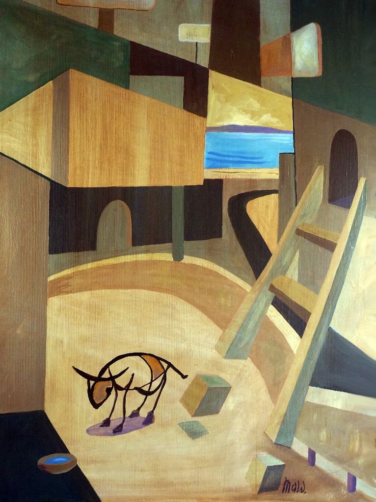
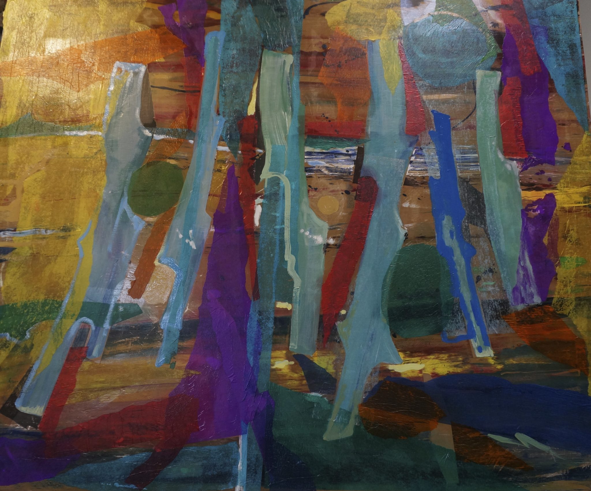
We have come to understand that in the pursuit of good design we often place the symphony of pure color in second place.  I am reminded of Tubular Bells by Oldfield and how fascinating the relatively simple patterns he creates stir us so deeply.  Essence of color in painting comes when we begin to place color as the foremost element.  Color after all has its own essence, its own purity.  It is even possible to abandon design entirely in creating beautiful art.  This is done by being sensitive to the purity of color itself, such as the relationship between tan/gold tones against those of blue and red combined or purple.  Those two properly and carefully juxtaposed creates a very unusual and effective dynamic.

abstract oil paintings with oranges, greens and grays
Symphony 20, 2017. Original painting by Michael A. Wilson

What we can call essence of color, where color itself is center stage depends greatly on contrast of hue and intensity.  A blue against gold as mentioned above is striking but when the contrast is deepened the energy increases proportionally.  There are no rules in this kind of arrangement but a heightened awareness is necessary.  Some colors seem completely muddied without employing proper contrast.  Though Rembrandt exercised extreme restraint for maximum results, the impressionists broke free from classic modeling to create scintillating dynamic compositions based essentially on pure color.  Blending of colors gave way to placing pure colors side by side to create a more vital, energetic effect…a dark hookers green placed adjacent to viridian (without blending) was discovered to be far more emblematic of nature itself.

Pluck one string on a guitar and then pluck an adjacent string in the same range creates a simple but resonating quality.  It seems the Tubular composition was after something like this – the subtlety of tones being predominate over particular style.  Painting with pure color arrangement, that is the dynamic of color effect and sublimating all design elements to the vitality of color is an exercise vital to the development of an artist’s maturity.  Tubular Bells by Oldfield depends on overlays.  This can also be accomplished with color arranging.  It is a fascinating process when executed skillfully.  In my own work I often start with hard-pressed drag painting.  This is done with dragging pigment across a hard primed panel.  This method creates wonderful though accidental effects.  These elements provide an excellent and dynamic base for a painting primarily concerned with the essence of color.  I then apply multiple overlays and critical accents.  Whereas Kandinsky would often title his paintings ‘Composition 20’ or such I find that composition does not suit this particular style of painting – this creative effort.  Though I made four or five preliminary sketches prior to beginning, I ultimately chose none of them but began to paint directly unto the panel.  The first layer was selective drag passages.  After that came multiple overlays and thus the reference (right or wrong) of Tubular Bells.  Then later, particular accents, deepening contrasts and adding some elements of design.  Therefore it seemed that the work was more of a symphony of color combinations rather than a composition per sey.  A symphony in my mind is a process of adding multiple instruments to create a complete structure, a complete piece of music.  Painting in this way seems to be very close to this creative process in music.  Spontaneous may not be accurate because though a painting like this stems from no particular composition, the work follows a process nevertheless, but it is a process that builds as it develops.  Each layer invites or evokes the next and myself the artist makes critical decisions which to choose.  Spontaneous tends to imply a impulse over thought but a painting like this definitely requires careful attention.  There must be a very conscious awareness of what the particular passages are ‘saying’ – what they elicit, what they require to follow.  I have titled this piece then,  ‘Summer Symphony  20’ .  This painting represents very clearly what occurs when essence of color takes precedence over compositional design. Summer Symphony 20 represents an important milestone for me personally because of this practically complete observance of painting  where color itself is the predominate element.

By the way I wish to thank my brother Jim and my sister in law Pam for their recent visit to my studio.  They spent considerable time looking over my work, even the several stacks against the walls.  It was fun sharing my work with them.  Both of them have a remarkable ‘keen eye’.

Posted on Leave a comment

Line Value in Abstract Art

Perhaps more than any other painting genre, abstract art employs lines to border forms.  Line value in abstract art becomes practically an art in itself.  Line value in this sense refers to the relative strength and thickness of the painted line.  It often also refers to the shade or darkness of the line.

Line value in Abstract art is used of course to enhance a particular form and to draw attention to a certain feature.  It is used selectively and rarely is every form bordered with a dark line which would appear repetitive.   Van Gogh would often employ lines to border forms and figures in his paintings so that they would stand out from the background or from other forms.  Van Gogh was not one to carefully blend his forms from dark to light.  The use of the heavy line served to distinguish his forms.  In one painting of a friend sitting in a chair, he used a heavy red line completely around the figure which literally popped out from the background.  It appears he painted this dark, red line while the painting was still wet so that in places the red line mixed with the image of the figure.

Kandinsky appears to paint his lines after the forms have been placed, set and dried.  This allowed him to paint very distinct, sharp delineation.  Line value in abstract art took on a whole new meaning as Kandinsky began to explore true abstract art.  His lines are remarkably painted with highly skilled brushwork.   I expect he used very refined round sable brushes for this kind of delicate work, especially the circles that he drew so often.

Posted on Leave a comment

Why buy Abstract Art

When it comes time to decorate your home or office, the question will inevitably come up – why buy abstract art? Millennials especially are looking for more adventurous art, bold forms and larger art that enlivens an interior. Prosaic landscapes and still life paintings, though charming lack the dynamism that an abstract piece carries.
There are so many good, contemporary abstract artists today. They are also easy to find on the internet. Purchases are easier and the paintings can often be purchased framed and ready to hang. Paintings found on the internet will usually note the size so you can make sure the wall you have in mind will accomodate the piece nicely. The beauty of a painting is appreciated when there is adequate lighting – especially at night. Consider hiring an electrician to install perfect spot lighting for your new purchase.
If you are asking yourself, why buy abstract art – consider how the right painting can truly enhance an interior environment. Many abstract paintings contain a certain mystery or metaphor that is intriguing. Mature, good abstract paintings still employ the fundamentals of good classical painting – those of balance, movement, harmony of form. A purchase of a quality abstract painting will retain its value, however always purchase a painting that resonates for you personally.
The price of a quality abstract painting, especially by a contemporary artist is usually very reasonable. There is of course something very special in buying a signed original painting. There really is no comparison to a flat image print – even when the print is by a known master. Prepare to pay an inflated price when buying from a gallery, though admittedly a gallery will often host excellent work by new, emerging abstract artists.

Posted on Leave a comment

Creating a Collage Abstract

Creating a collage abstract is yet another excellent way to begin expressing yourself.  In previous articles I have talked about how and why to be creative with drag paintings.  Drag paintings can be expressive and fun without getting hung up on representing some known form or trying to duplicate on nature.  Collage has that similar characteristic.DSC02678.jpg

Again, my preference is for board panels which  have been primed and sanded so that the surface is fairly smooth and flat.  This works much better than canvas.  My own preference in working with collage is with tissue paper.  I use colored tissue paper which comes in a remarkable array of colors.  The other key ingredient is water based varnish and a good wide brush.  I also have on hand several small plastic spatulas.  I typically tear the tissue paper into shapes.  This is an abstract so precise cuts and tears are not necessary.  I approximate where the piece will go and then lay on a coat of varnish.  I then apply the tissue paper and brush it out thoroughly with the varnish brush.  If it appears too mottled or wrinkled then use the plastic spatulas to even the paper out.

That is the basic method.  Overlaying one tissue paper color over another creates of course an entirely different color and this kind of translucence is exciting.  Often surprising effects are created.  Tissue paper collage, by nature is vibrant and exciting.  It is not necessary to cover the entire surface area.  I will often add painting effects to the collage.  After the quick drying varnish dries and after the paint dries I suggest studying the piece.  Inevitably you will see the areas that are weak and those that are holding their own.  The beauty of collage is that you can now add layers to the previous work.  Every layer adds seems to add more interest.  This kind of tearing up of tissue paper and pasting it over with clear varnish creates some astonishing effects – sometimes resembling stained glass.

Ultimately as artists,  these several methods of creating abstract art can be tremendously liberating.  Abstract art, after all, affords us an opportunity to create without worrying about or waiting for some grand theme.  We can just begin and let the piece evolve as it will.  We are realizing that there is more, much more inside us than we give credit.  There seems to be an inexhaustible voice within and abstract work such as collage and drag painting  provides the means for our expression.

Posted on Leave a comment

Contemporary Art


Contemporary art as a style goes back as far as Picasso and Kandinsky from the 1050’s.  Contemporary art typically refers to art that no longer relies on realistic images for subject matter.   I recently visited the showing of abstract art here in San Diego which featured works from Gauguin to works as recent as 1960.  These represented a wide range of artists with very different styles.   Apparently the show started progressively with Gauguin because he was one of the first to abstract and flatten planes into modular colors.  Depth and perspective became less important.

Fortunately artists today can choose from a wide range of styles that can be classified as contemporary art or ‘modern art’.   Broadly speaking, any work of art that varies from natural forms and realistic perceptions can be considered contemporary.  Technically when  an artist purposely abstracts realistic images it would be more accurate to say that they are an abstract painter.  This is more narrow, precise way of describing this type of art under the umbrella of Contemporary Art.

It is interesting that work from the 1950’s and even earlier can be classified as contemporary art, along with work produced now in 2014.   This broad umbrella of style allows for multiple genres.   As an artist who prefers to leave naturalistic images and to explore abstraction there are many varied styles to choose from.  With experimentation it is possible to find the style and manner to express your own feelings on canvas.  For example we know how different Jackson Pollack is from Rothko or from Kandinsky.  There are artists today who have studied these past masters and have developed their own unique expressions.

Contemporary or abstract art is not for everyone.  The majority will prefer to view something that is recognizable,  something pleasant and bucolic such as the paintings of the commercial artist Kinkaid – the so called ‘painter of light’.  Abstract art pursues those realms that are not so easy to identify.  They stir up feelings which may run deep but we are not sure why.  We have to appreciate those artists who are willing to explore these other dimensions.  There is a certain adventure and energy in this type of exploration perhaps because it invokes not only the natural responses but also sub-conscious responses.   Translating these sub-conscious responses requires greater sensitivity to our inner feelings.   We can sense this thread of exploration even back from the early contemporary, abstract art of the 1950’s.  It will be exciting to see what turn the abstract artists of our era produce.